 Last week I was lamenting that we were done with the simple User folders, but wait, I forgot one. I missed it because it did not exist in XP. After digging around in the original icons, I realized that we have pretty much have everything we need to make the new Search folder. Last week I was lamenting that we were done with the simple User folders, but wait, I forgot one. I missed it because it did not exist in XP. After digging around in the original icons, I realized that we have pretty much have everything we need to make the new Search folder. |
Day 15 (Monday, August 25th, 2008)  |
|  The Search Folder. The Search Folder.
When I started looking around the User folder today, I noticed that the the Search folder would be pretty simple to put together. I also noticed that the existing Search folder seems to have been put together in a rush as well.
It looks like they were originally just going to do the glass bits in the Wrapper folder, then decided it was not "search" enough, so they grabbed a magnifying glass and slapped it in front of what they had. The folder has one shadow, the glass has another, and the folder has a perspective 3D look. The glass is flat, and straight out of a Photoshop tutorial.
This lack of continuity with the rest of the User folders is kind of sad considering how much time and effort went into the Window Vista icons. The good news is that we should, in very few steps, be able to create something better.
|
| Step 1:
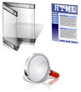
Once again we gather our assets together. All we will need is the Wrapper folder, the 1.0 Search icon (#81) and the File icon we created on day 9 for our Favorites folder.
 | Step 2:
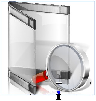
Now as luck would have it we can pretty much just flip our existing search icon, size it and skew it just a bit, and it works pretty much perfectly with our Wrapper folder. Even the shadows and reflections still work with a bit of cropping.
 | | Step 3:
At first I was just going to put the glass in the Wrapper and call it a day, but we can do better.
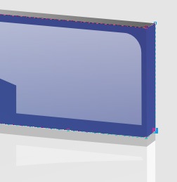
Lets put a few files in the folder. They will be blank, so I remove everything but the top bars from the file. I also tweak the fill just a bit, because I want the color to wrap around the edge of the file.
| Step 4:
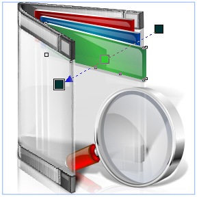
Now we simply duplicate our file 3 times, and change the color of the bar on each. Once I am happy with them, I move them into the Wrapper.
While we have them together, I go ahead and touch up the gloss on the files.
 | | Step 5:
Tonight our classic last step is made much simpler by the fact that most of our shadows and reflections are good to go. All we need to do is give the treatment to the files.
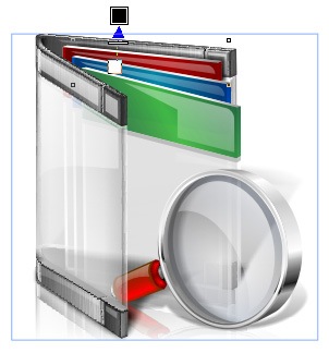 | Finished Icon:
There we go, a new Search folder, this time with some continuity.

| |
Wrap Up:
Tonight's icon, will be the last Icon-A-Day icon until next Thursday, since will be on vacation. I will, however, be back tomorrow with a special Icon-A-Day supplemental. Check in tomorrow night for a special surprise.
About Me:
You can find all my skins, tutorials, and articles, on my Wincustomize Homepage, at http:\\mormegil.Wincustomize.com. Questions on icon use and techniques, can be emailed to mormegil@gmail.com. Twitter users can find me with the user name: Mormegil.
|

Find all the Icon-A-Day tutorials, and links to the icons and more at the Icon-A-Day 2.0 Index.
All Icon-A-Day artwork, copy, and icons, are copyrighted by Paul Boyer © 2008, and may not be used with out express permission. |