 The first Icon in the original Icon-A-Day series was the Closed Folder. I have to admit that I was not quite sure what I was getting into at the time. This time I do, so we will begin once again at the beginning, with the Closed Folder. The first Icon in the original Icon-A-Day series was the Closed Folder. I have to admit that I was not quite sure what I was getting into at the time. This time I do, so we will begin once again at the beginning, with the Closed Folder.
|
Day, 3 (Wednesday, August 6th, 2008)  |
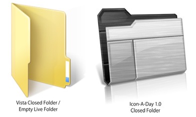
The funny thing about the Closed Folder icon is that by default, in Vista it is no longer closed, it is just an open, empty folder. I must admit that I kind of like this convention, but if you have a logo or something you want to showcase you lose one of the most often seen blank surfaces in Windows. So in icons, like the My Colors NBA Icons that I did last year, I made the folders completely closed.
To further complicate things, in Vista we have Live Folders, so unless a folder is empty, you pretty much never see the default Closed Folder anymore. It is still seen in the tree view in Explorer, but only at 16x16. I want to keep more or less the same feeling that we had in the original Icon-A-Day icons; the same Sci-Fi brushed metal finish, but we have to make sure that they fit into the new Vista scheme of things. What all this means is that the Closed Folder will more or less be our blueprint for the Live Folder icons that we will be tackling on Day 5.
One Last Important Note: I am going to jump right into these tutorials where we left off, in that I will be assuming people have seen the original series. These tutorials are more to help people understand how to create high quality icons, not a "How to use CorelDRAW" tutorial set. I have one of those, it is called CorelDRAW for Skinners and even though it is also a few years old, it you can use it to better understand some of the terms I toss around. I will be updating it as well, as this project picks up steam. But in the mean time I will be keeping some of the technical aspects pretty basic. If you have CorelDRAW questions, or questions about my techniques, please ask in the comments and I will try and answer; at the least it will give me ideas for new CorelDRAW for Skinners videos.
With that said, lets get this party started.
|
Closed Folders:
The most obvious change to the folders in Windows Vista is their orientation. Though not the first ones to do it, it is now known as the Vista Style.
Sadly I was not aware of this change back in January 05, much less the fun that would come with the Live Folders, so our original Icon-A-Day folder was quite simple and followed the more conventional orientation of the time.
Because of the complications that Live Folders add, it will be simpler for us to adopt the Windows Vista Style folders in 2.0.
|  | | Step 1:
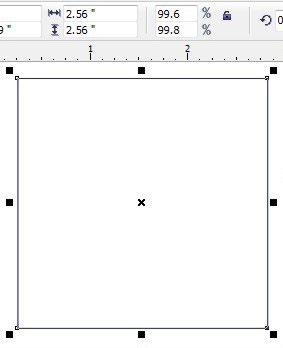
The first thing we will have to do is establish our new default size. This time In Corel we create a new Document and create a box, 2.56"x2.56". When we export our final icon, it will be 256x256 at 100dpi.
 | Step 2:
Now, in almost the exact way we did last time, I start with two (2) rectangular Mesh Fill Objects, each with only 1 grid length. I will then start to push them around with the shape tool to get our basic shapes established.
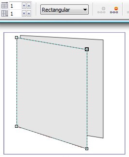 | | Step 3:
As I mentioned above, I want to keep the same basic look and feel as the original folders, so using the shape tool, I will begin by sculpting our mesh's into more or less the same folder we had before, just standing on its side.
Once we have the basic shape, I also give it the base colors, we will need. I do this by selecting each shape and assigning the same colors to all the nodes in the mesh.
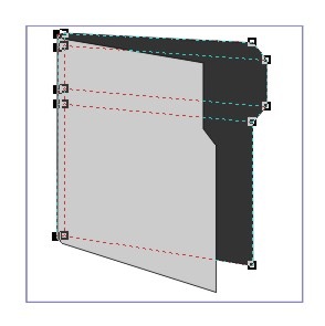 | Step 4:
Now we begin to use the Mesh Tool in earnest. This is basically the same as in Icon #1 of the original series. You can learn a lot more about the Mesh Tool In the CorelDRAW For Skinners Tutorials.
First I go through and add several new mesh nodes. These will be used to give our folders depth, and realism. As I do this I start tinting the colors by selecting one or more nodes and holding down control, while clicking on a color in in the Palette. In this case I will more or less be using black and white. I just keep this up until I am happy with the end result.
 | | Step 5:
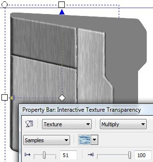
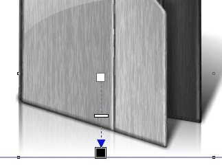
Once we have our shapes and fills set, we need to add some flare. We will do this with the same tricks that we used in our original series, starting with adding a the signature brushed metal texture.
We will do this the same way as before. We copy both the folder front, and the folder back. We give them both a 50% black fill, and then use the interactive transparency tool on both new objects, giving them a multiplied and stretched texture. See Corel For Skinners for transparency tips.
 | Step 6:
After we have our texture established, we have to get in the ever present gloss. This we do by drawing in a few shapes and filling them white. Then, once again we use the Interactive Transparency tool, to create a gradient blend, fading out our white shapes, leaving the classic gloss.
Since our folders our now facing up, and the front of the folder is not facing directly into the light source we will have to fake the gloss a bit more, but we want to keep it in order to maintain a uniform look.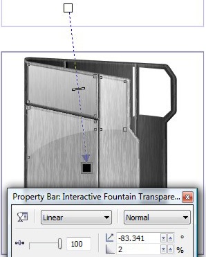 | | Step 7:
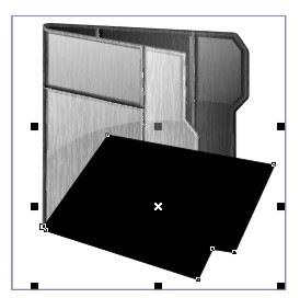
One of the staples of the Icon-A-Day icons was the shadow. At this point we run into our first Vista Style conflict. The original icons all had a shadow dropping to the left, and back. Windows Live Folder thumbnails, actually generate their own shadows that drop to the right and back.
In order to deal with this, we will have to change our shadow to the Vista Style. However the lighting on our icons is still in the 1.0 direction. Hopefully this will not tell on us too badly.
 | Step 8:
The shadow brings us to one of the big changes in the new version of Corel. In the original icons, when we made a fancy shadow, I would just use the drop shadow of a shadow mask shape, then I would break it apart and fade out the resulting bitmap with the interactive transparency tool.
In Corel X3 or above when you break apart a shadow, it does not leave a bitmap, it leaves a mask. Rather than going into why, just understand that now you have to convert that mask into a bitmap to use the original technique. So that's what we will do here.
 | | Step 9:
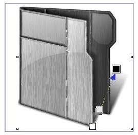
The final signature feature we need to make this truly an Icon-A-Day icon is the reflection. This is going to be a bit difficult, because of the much taller aspect of the new folder. But we will do it the same old way. By copying the front and back of the folder, converting them each to bitmaps, then flipping them.
Once we have our flipped bitmaps, we can squish them down, and skew them into place. Once they are in place we use the Interactive Transparency tool to fade them out.
 | Finished Icon:
There we have it, the first new Icon-A-Day icon in almost 3 years. We will be using this folder as the base for our next few icons, so they should go pretty quickly.
 | |
Wrap Up:
As I get back into the flow in the creation of these tutorials, and as I get to know who is reading them, and what they are interested in hearing about, I should be able to streamline. But I seems kind of fitting that our 2.0 Closed Folder took the same amount of steps as the original.
Once again, I welcome feedback. As a mater of fact I am relying on it, so please comment. Join me tomorrow as we make our new Open Folder icons.
|
All Icon-A-Day artwork, copy, and Icons, are copyrighted by Paul Boyer © 2008, and may not be used with out express permission. |